新しい視点
ビデオエッセイ「生きてる人、いますか」
旅と足あと
近況
Fediverse・テキスト投稿
気になること
人生の取説
音声版・ポッドキャスト「やまない雨に種をまこう」
生き方の個別指導(悩み相談)
気になること
ことば無し
言葉のない動画「ひと静く」
撮ったもの
写真や動画
ものごと
タグ・要素
お話と管理
ライブ配信「月ひつじと夜を巡るお話」
メッセージを送る
DMする
ログイン状況
こたって?
COTAって?
創ったもの
ポートフォリオ
予定と履歴
人生の方針と理念
いのちの理由
お墓と花の家
検索
新しい視点
ビデオエッセイ「生きてる人、いますか」
旅と足あと
近況
Fediverse・テキスト投稿
気になること
人生の取説
音声版・ポッドキャスト「やまない雨に種をまこう」
生き方の個別指導(悩み相談)
気になること
ことば無し
言葉のない動画「ひと静く」
撮ったもの
写真や動画
ものごと
タグ・要素
お話と管理
ライブ配信「月ひつじと夜を巡るお話」
メッセージを送る
DMする
ログイン状況
こたって?
COTAって?
創ったもの
ポートフォリオ
予定と履歴
人生の方針と理念
いのちの理由
お墓と花の家
つくる
創作物一覧
表紙
つくる
ひと静く – siLence Reveals
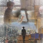
生きてる人、いますか
やまない雨に種をまこう
生きてる人、いますか
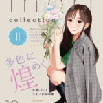
多色に煌めく
COTAロゴ・モーション
投稿のページ送り
1
2
3
次のページ
クッキー
COTA(こた)のサイトを正しく見るために、クッキーと呼ばれる一時的なデータをご利用の機器に置くことがあります
くわしく
わかった