Creativity with a twist in a neat and tidy way.
COTA COTA is,

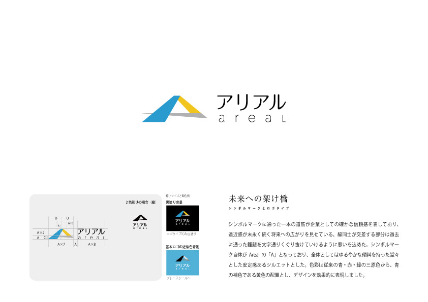

The single line of the symbol mark represents the company’s solid trustworthiness, while the perspective shows the expansion into the long-lasting future. The intersecting lines represent the company’s desire to literally pass through the challenges it has faced in the past. The symbol itself is the initial letter ‘A’, and the overall silhouette is gently sloping to give an imposing and stable impression. Colouring was changed from the conventional three primary colours of blue, red and green to an arrangement of the main colour: blue and its complementary colour, yellow, to effectively express the design.