To fit in with the environment but to be a bright shining light.
COTA COTA is,

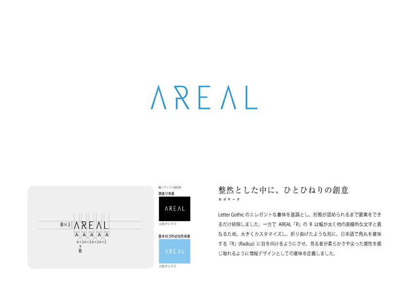

The typeface is based on an elegant typeface and the elements have been eliminated as much as possible until the form is recognised. On the other hand, the R in the component letter ‘R’ is thicker in width and different from other linear letters, so it was largely customised and folded into a folded form. We made the viewer look at the ‘R’ (Radius), which means rounded corner in Japanese, so that the viewer can perceive softness and sharp sensibility.